
All posts by ChiefRalphWiggum
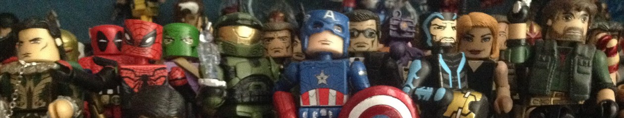
Minimates

Abraham Ford


Marvel Minimates Wave 59: All New X-Men Iceman and Sentinel

Welcome back to another review! I haven’t done one since May due to real life constraints but now I’m planning to maybe do a review every fortnight. Anyway, onto this weeks review which, as the title says, is of the Wave 59 All New X-Men two pack of Iceman and a Sentinel.


Up first is…
Iceman

His bio reads- Ice-controlling X-man Bobby Drake was shocked to see his unusual form his older self has taken, but even a grim, confusing future is not enough to rattle the teams resident prankster.

Iceman has a confident-kind-of-smirking face which I think whoever designed it nailed. It’s very basic as I’ve said, so it makes it hard to write about. I just hope my pictures give it justice!

Iceman’s chest is also has a lack of things to really write about. I do like the belt, though. You can also see the blue lining of his costume which is very cool looking.

The back of the torso just has the continuation of the costumes liming. Something especially nice about the figure is the colour selection of White. Now, I’m a sucker for transusent Minimates, but I never thought that it worked for Iceman- and almost every Iceman before this has been translusent.

The arms also have the lining. Unfortunately mine has some scuffing on the left wrist area but it’s nothing too serious so I don’t mind.

The legs are well detailed for what they are. I think the little black lines used to make it look like Iceman isn’t smooth are an awesome touch.

Iceman comes with three accessories; an ice-slide base, an ice-blast and a display stand. They are all translusent plastic with the two ice accessories being a cloudy white colour. They work perfectly for Iceman and allow for fantastice display options. Ive got some photos of them in use down below.

Iceman is completly vanilla and so all of his 14-points of articulation are able to be used fully. His display stand is also useful if you want your Iceman in a flying-ninja kick while shooting ice.

Overall, I give Iceman an 8.5. His accessories are great and I think the simplistic non-translucent design was executed very well.

Here’s a comparison of Iceman to another vanilla-surfing buddy, Silver Surfer.
Up next is…
Sentinel

His bio reads as- A robotic soldier originally designed to hunt and neutralise mutants, the Sentinel was developed by the U.S Government in response to what they saw as a threat to all humankind.


I just want to first apologise for the lack of pictures of the Sentinel. For whatever reason I couldn’t get my camera to focus on him. But anyways, I think the face on him is perfect- it’s got that almost creepy, lifeless look of a robotic killer. He also has a helmet to capture that somewhat iconic head shape. His torso has a bulky shoulder piece, most-likely a reuse from an Iron Man, that I think works very well for him. The actual torso itself has minimal detail but I feel likes that all he needs.

The back of that shoulder piece has some excellent sculpt work. There is also a belt part around the hip to make the Sentinel taller. I’m not a huge fan of how it slims out in the middle, but I can live with it.

The legs have nothing on them and he has a large set of boots to further increase his height.

For accessories he comes with MODOK’s flight stand and since he reuses Omega Red’s gauntlets, the Sentinel also has a set of tentacle pieces. I’ve never red a single issue of All New Xmen so I’m not sure how accurate this is, but it sure looks cool and is a nice idea.

One complaint I do have with him is the base. Or, not with the base but with the choice of base. I don’t like it how there’s only one foot peg. It doesn’t look like both of the Sentinels feet are helping him to fly which I don’t like. There are certain angles where you can make it look like he is (pictures below) but I woud like it if maybe DST would invest in a new take-off stand. The MODOK one would be perfect albeit had space for two feet.

Articulation wise, the Sentinels pretty good but has a few hindrances. His head is only able to swivel due to the helmet and shoulder pieces and he has no ankle movement due to the boots.

Just to show how tall he is, here’s him next to what I believe to be two of the largest 2-inch Minimates.

Overall, I’m also going to give the Sentinel an 8.5.
Photo Gallery


Minimates Age Of Ultron Boxset Review (Part 1/2)!
Welcome back to another (very, very overdue… Sorry) Minimate review!
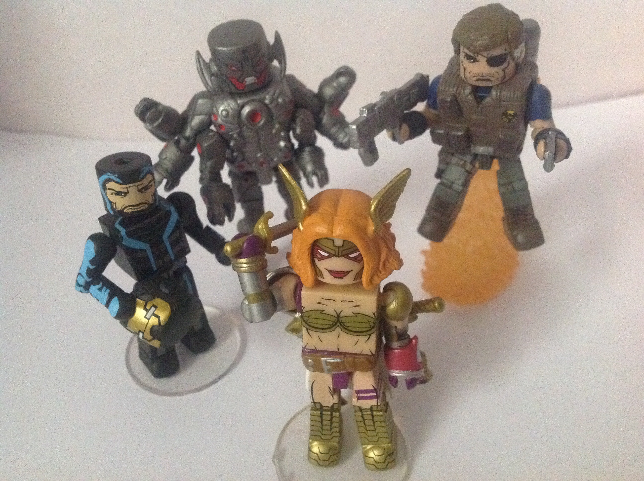
This is probably one of the best boxsets released in a long time. As the title states, I’ll be splitting the review in half so that I can talk in as much depth as possible about each figure. Also, like the last review I unfortunately no longer have the packaging but thanks to Google I can show it to you.

I really, really like the box. I don’t think any other boxset or series has ever had the golden colour, but as I said- I absolutely love it. The picture of Ultron up top looks awesome and the cartoon pictures along the side always look fantastic.
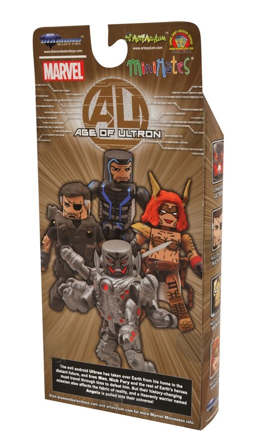
The back of the box is equally impressive. The computer- rendered image shows of all the figures quite well. Although, Iron Man has no hole in the top of his head but the actual figure does.
The bio reads “The evil android Ultron has taken over Earth from his home in the distant future, and Iron Man, Nick Fury and the rest of Earth’s heroes must travel through time to defeat him. But their history-changing mission also affects the fabric of reality, and a heavenly warrior named Angela is pulled into their universe!”
Nice read-up. I prefer bios for individual characters, however.
Age of Ultron Iron Man
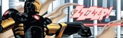
Finding a comic picture for this suit was very difficult. First of all, I think he wore the suit pictured above in the AOU storyline (though I could, probably, am wrong.) and the only other pictures of the suit, dubbed the “Zero Gravity” suit were of a Marvel Universe figure.
*Thanks to DSTZach for providing a picture of the suit from AOU-
Pushing that aside though, here’s the actual review of the figure.
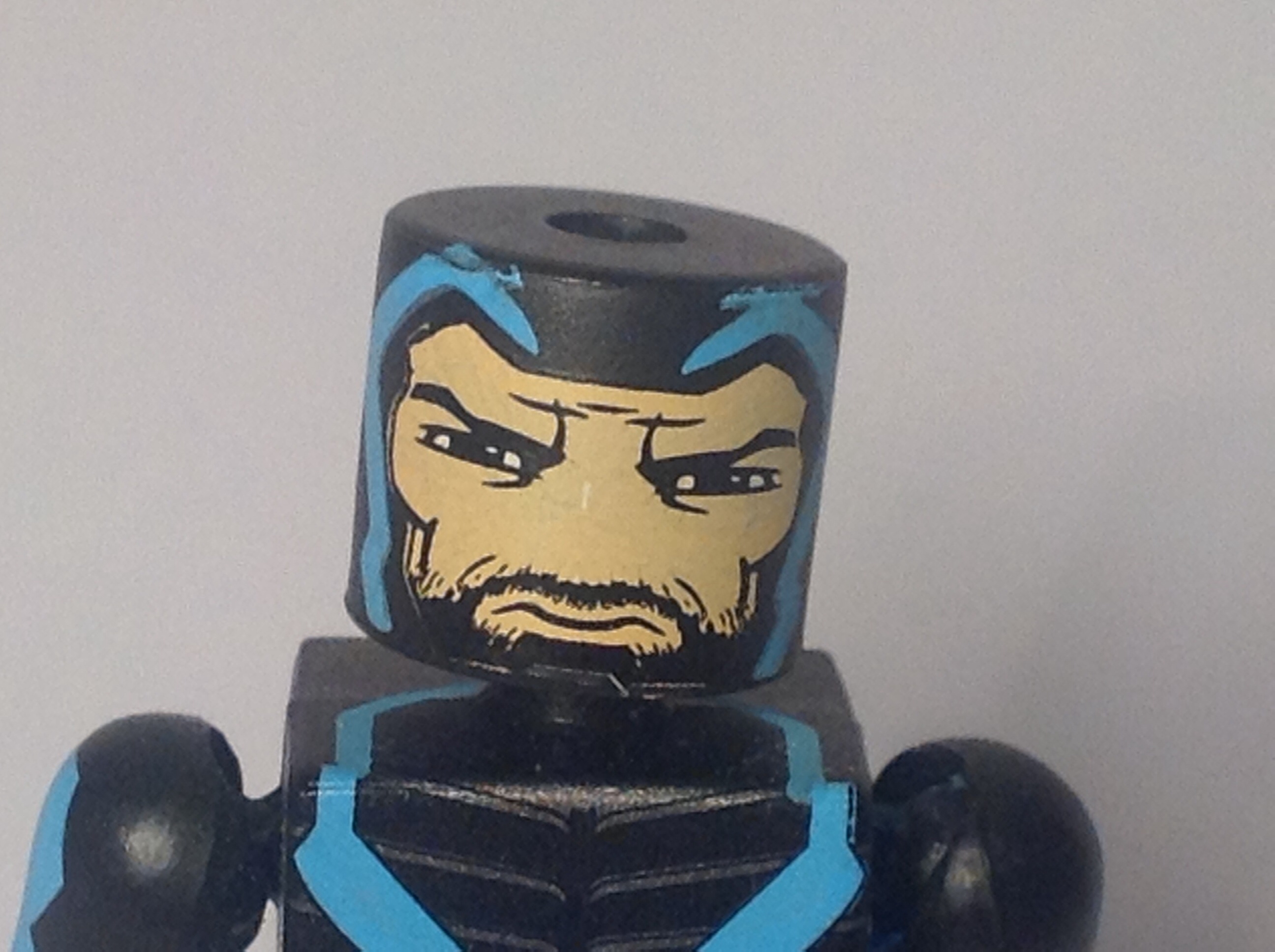

The face is very well done. The blue lines really stand out on the black. The face has a stern, serious look which is something different from the usual smirk of a Tony Stark. It’s also great to see two different shades of black were used on the beard and the helmet. The back of the helmet is unfortunately blank, but it’s something easily overlooked.


This Iron Man is a little different from the others, as it has no bulked up pieces. It’s something unique and I can see why they chose to go this route. All the details are nice and crisp and with the exception of a small scratch on the back are all done perfectly. I love the continuation of the blue line work, it just looks so cool in comparison with the black and greys. The legs continue to have nice paints apps and the bottom section of the leg is a metallic grey colour.
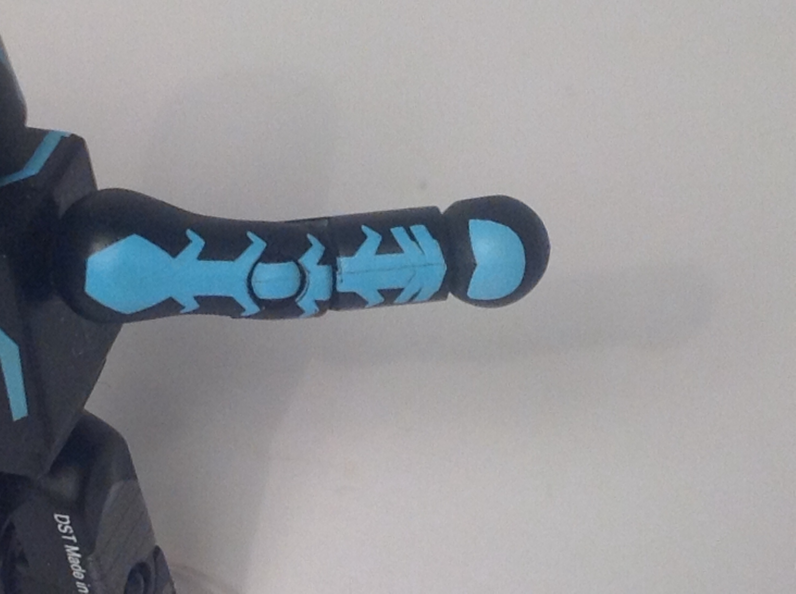

Some if the really nice details include the arms and the top of the torso. Getting paint details on the top of torsos is a rarity and is necessary for this figure. The arms as well as the hands look fantastic, the blue wiring came out superb.
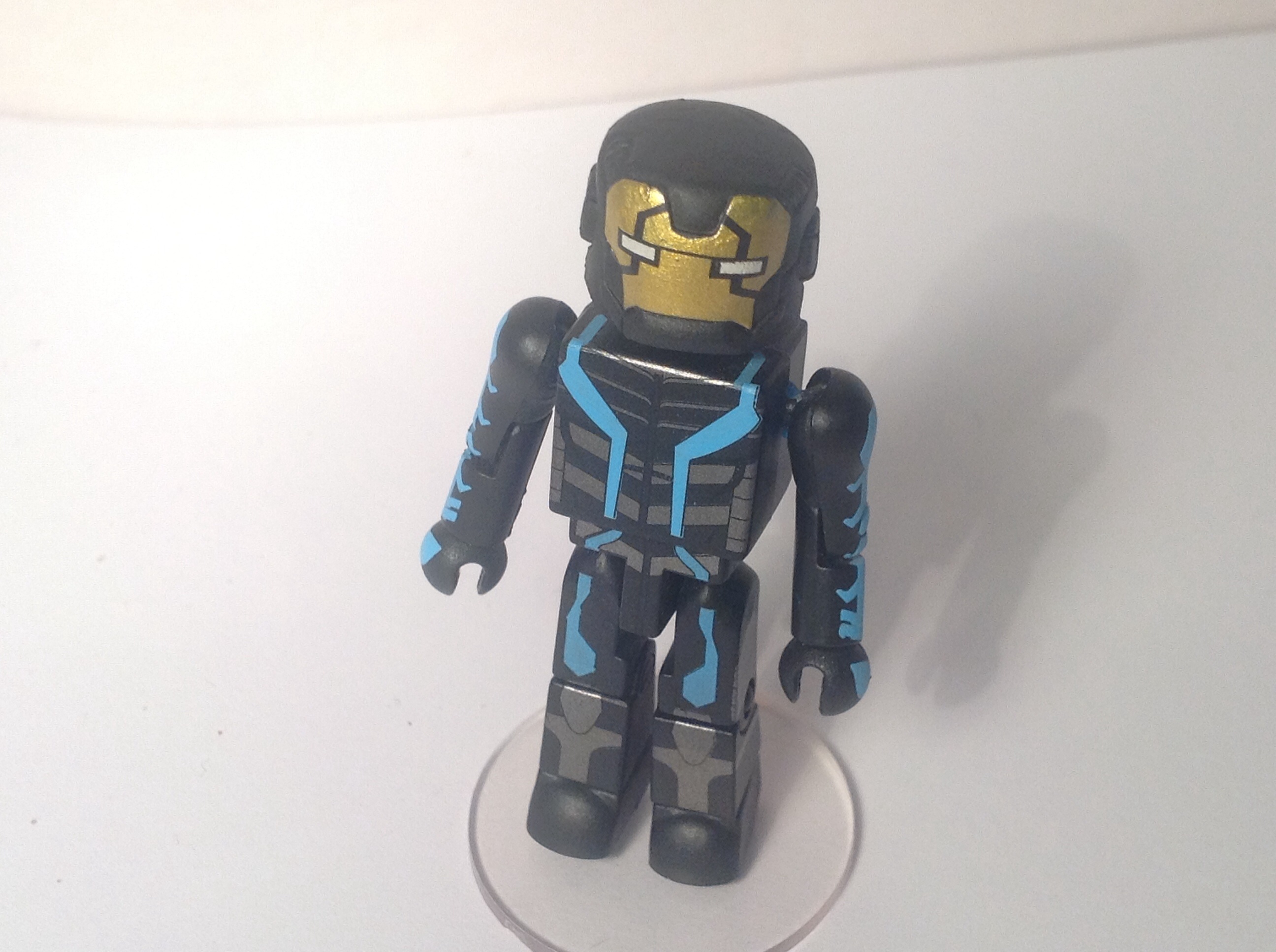
For accessories he comes with the staple display stand as well as a helmet, which I don’t really like. The gold colour just doesn’t match with the rest of the design and I think it should’ve been either a blue or grey. I suppose that’s the design of the character its not DST or Art Asylum’s fault, though.
For an overall score, I’d say AOU Iron Man has earned himself a pretty strong 8 out of 10.
Age of Ultron Nick Fury

After the huge success of Samuel L. Jackson’s take on Nick Fury, all of the new comics seem to based of that appearance. Unlucky David Hasselhoff. However, in the AOU storyline they went back to a more scruffy looking Nick Fury. I prefer the ‘Jackson Fury, but an updated white Nick Fury was sorely needed.
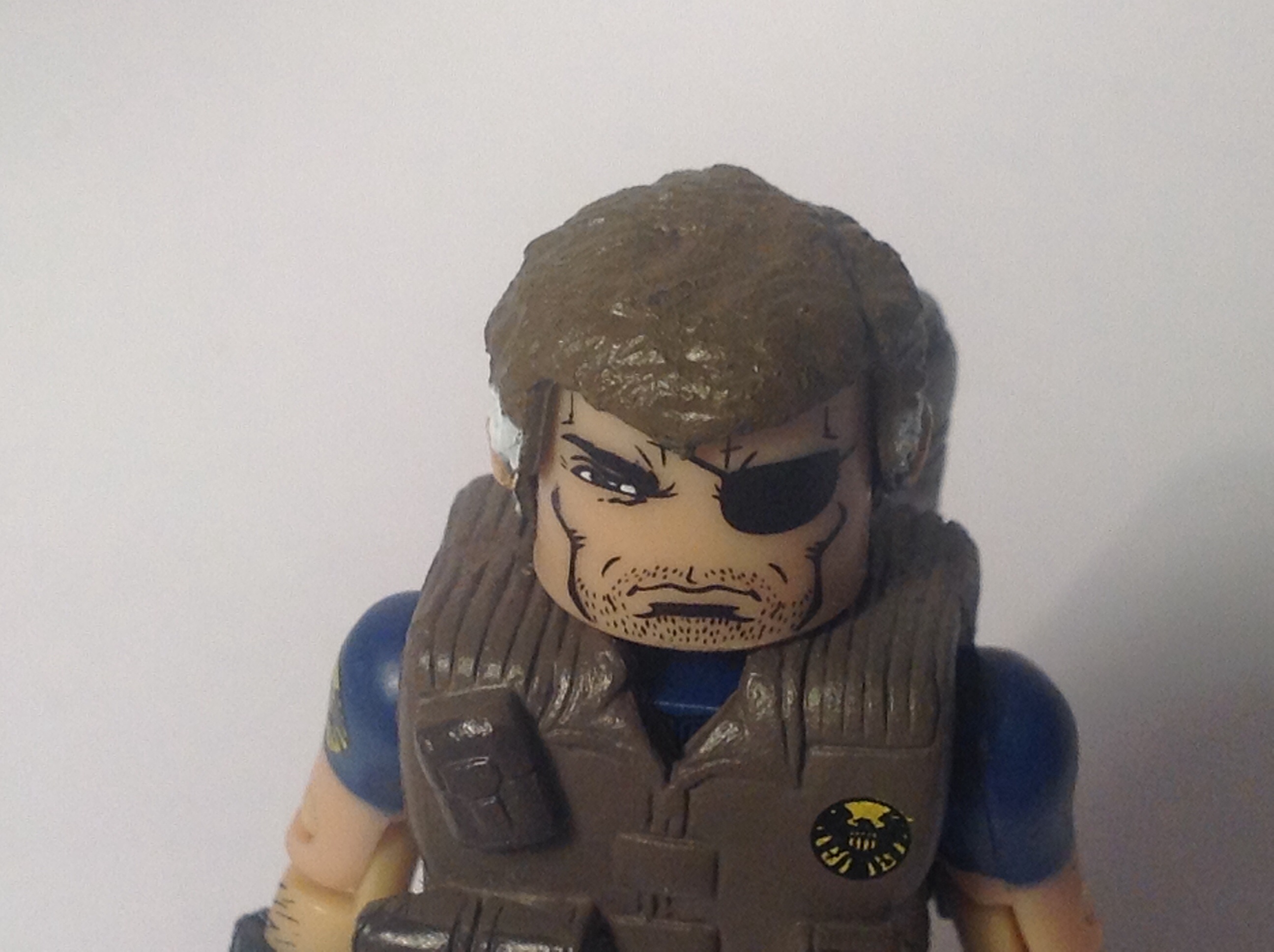

The face is one of the best bits of this figure. The rough looking expression is top notch, and to complete it the un-kept stubble and eyepatch add that much personality to him. The hair is most likely a re-use and it keeps that un tidy look which I love. (But not as much as the trench coat….)
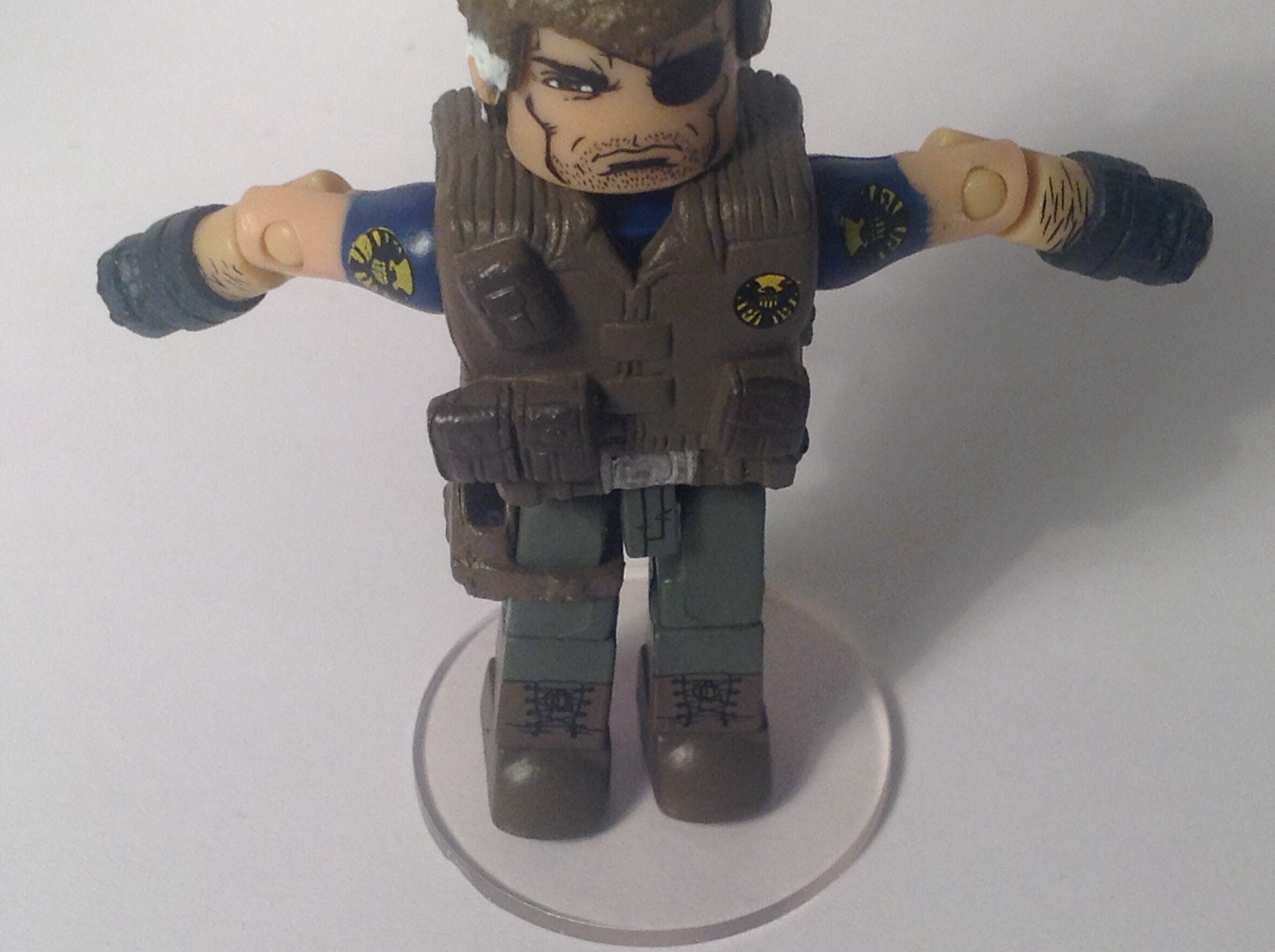
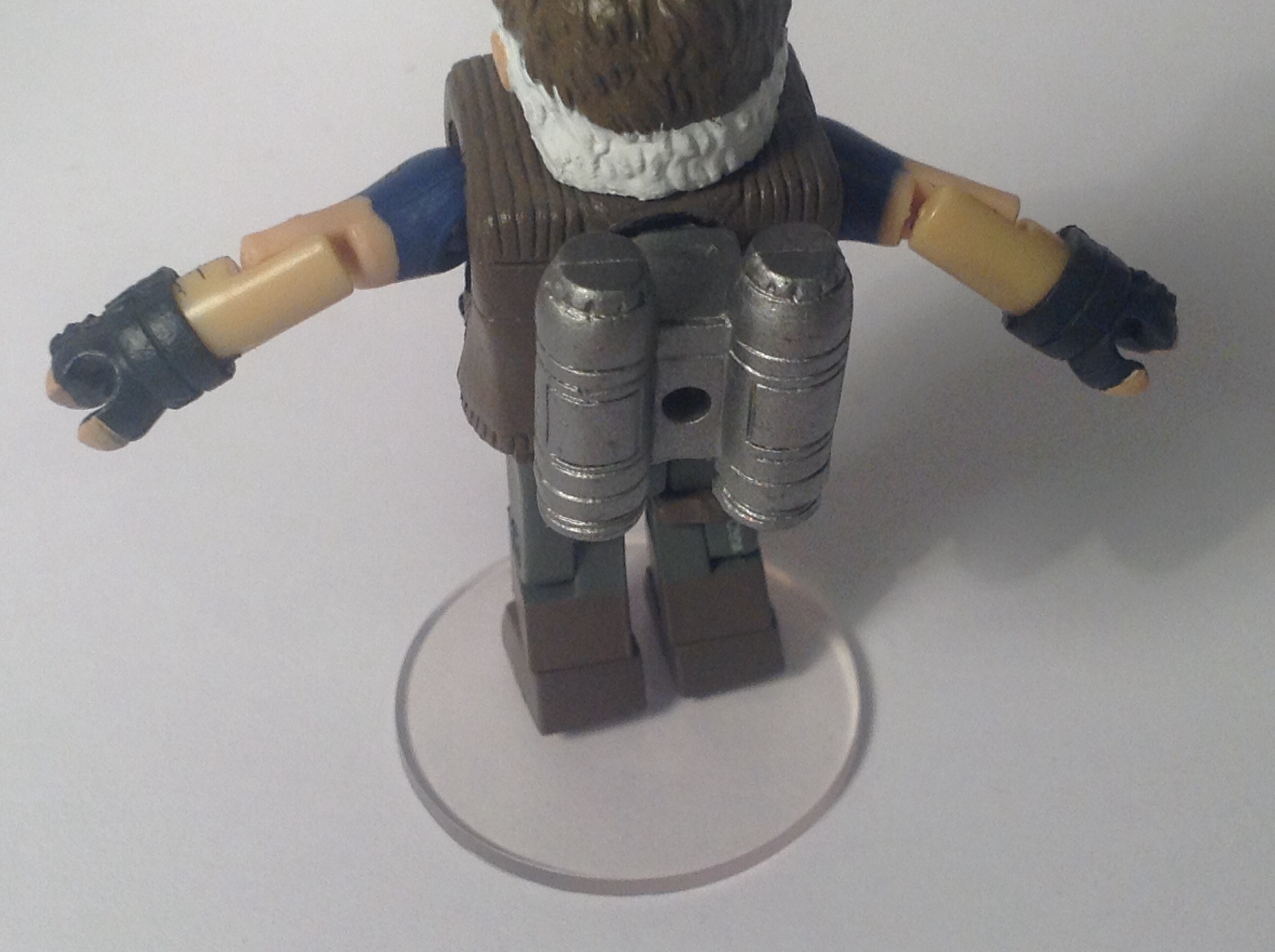

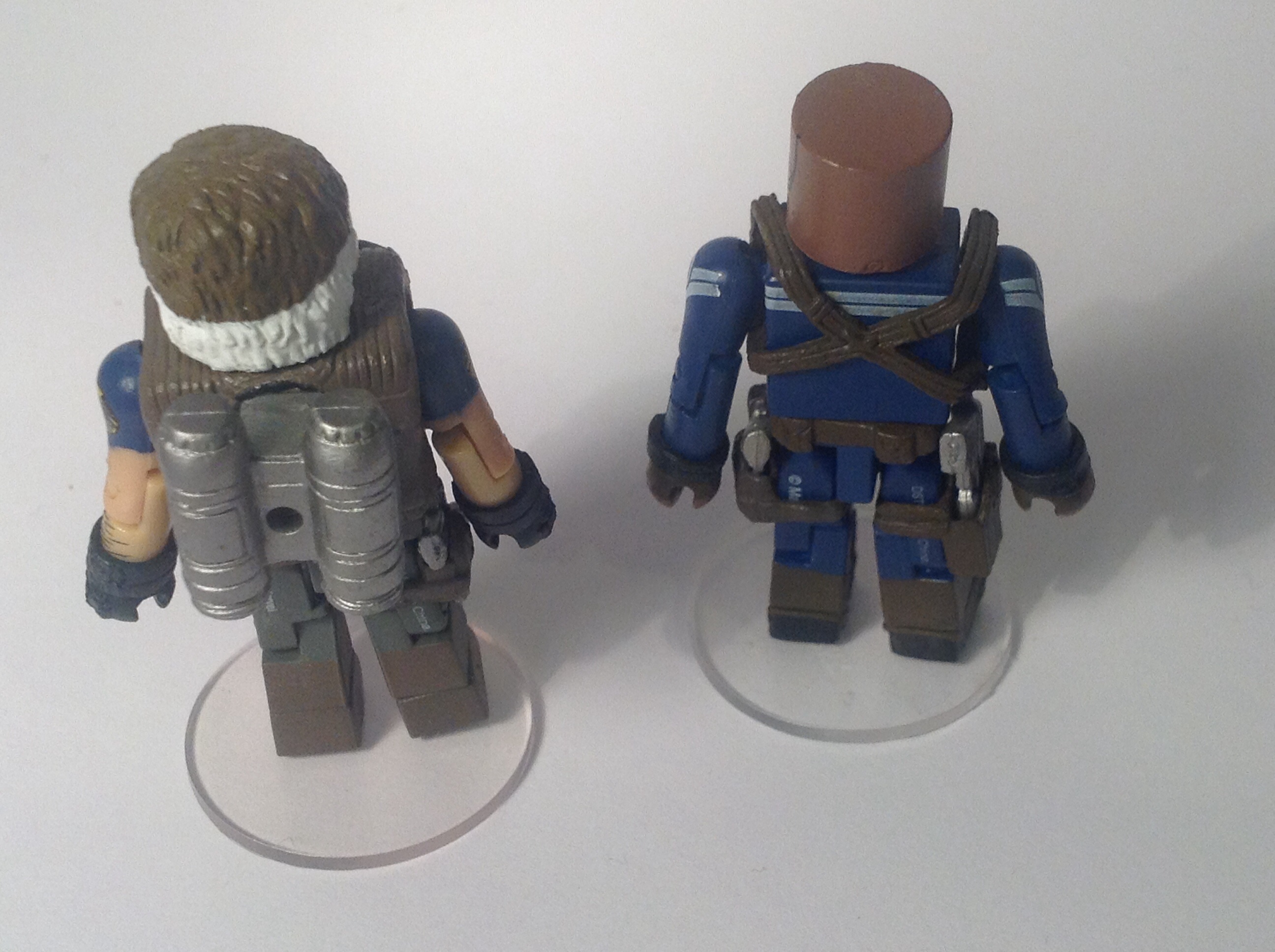
The body has this nice militaristic vest on top of it which is done brilliantly. It has various pouches on it and a nicely painted SHEILD logo on the top right. This is where my one and only complaint with the figure is- the fact the jetpack is not removable. I’m not sure why they chose to do it this way and I haven’t tried to remove it as I’m worried it’ll break the vest piece. The arms are done well and on each shoulder is another SHEILD logo. Another slight nit-pick is that the upper and lower arm are slightly different shades of colour, but it’s barely noticeable as not only does he have a big pair of finger-less gloves on but he also has some nice arm hair painted on. The legs are quite simple and the only real detail are the boots but he also has a holster for his pistol.

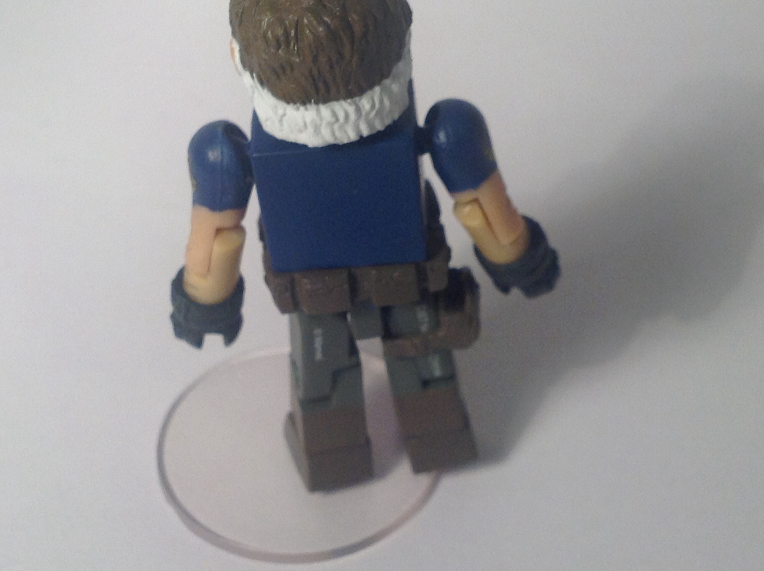
A really nice thing about Nick Fury is that under the vest are some really cool details. He is wearing a navy blue shirt which, like everything else, has a SHEILD logo on. I’m torn between which look I prefer but if I had to choose I’d say the vest is a better look for him.
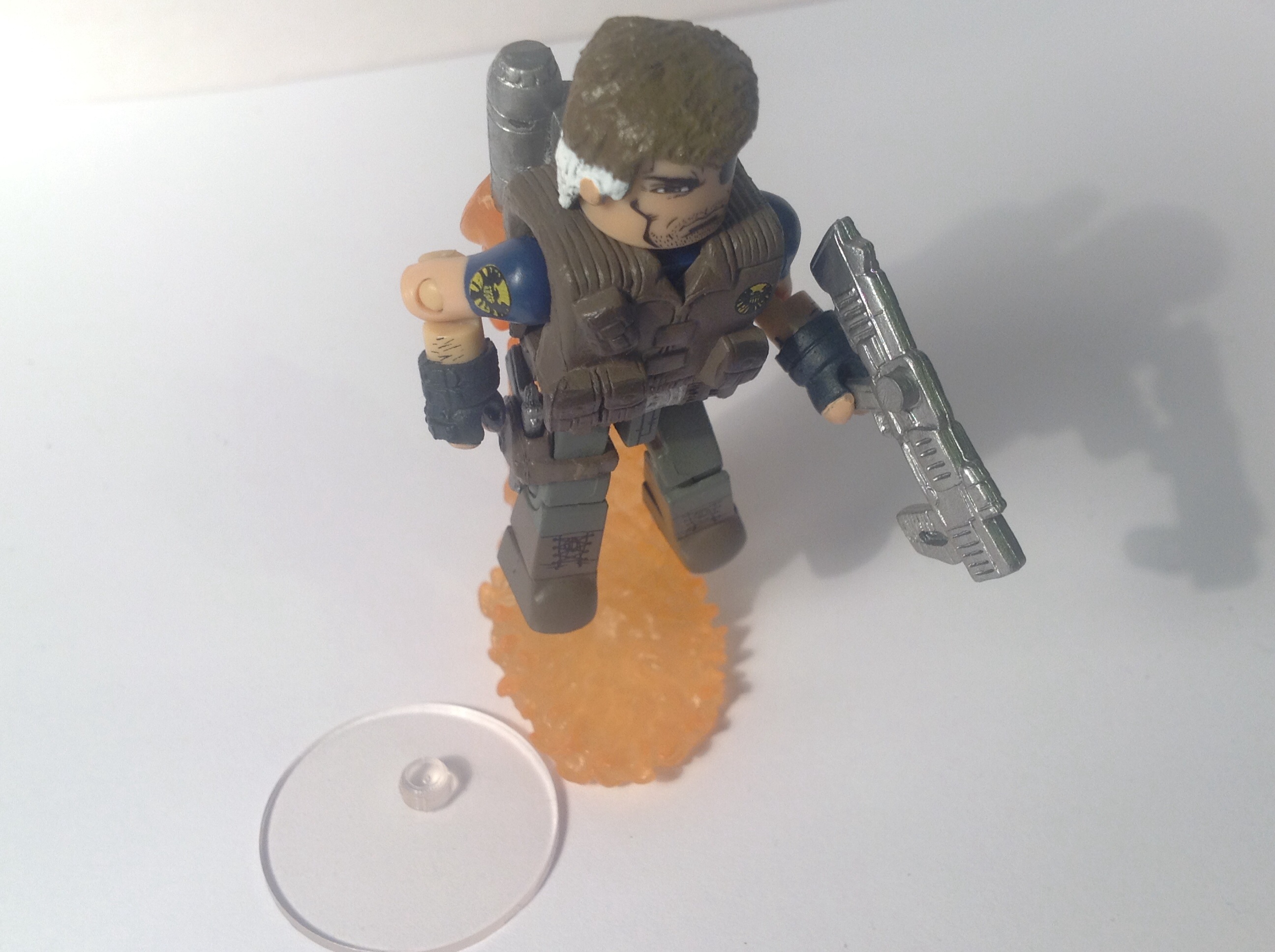
For accessories he also comes with a display stand, but also included is a pistol, Hope Summer’s rifle and the two pieces needed to make the jetpack flying effect.
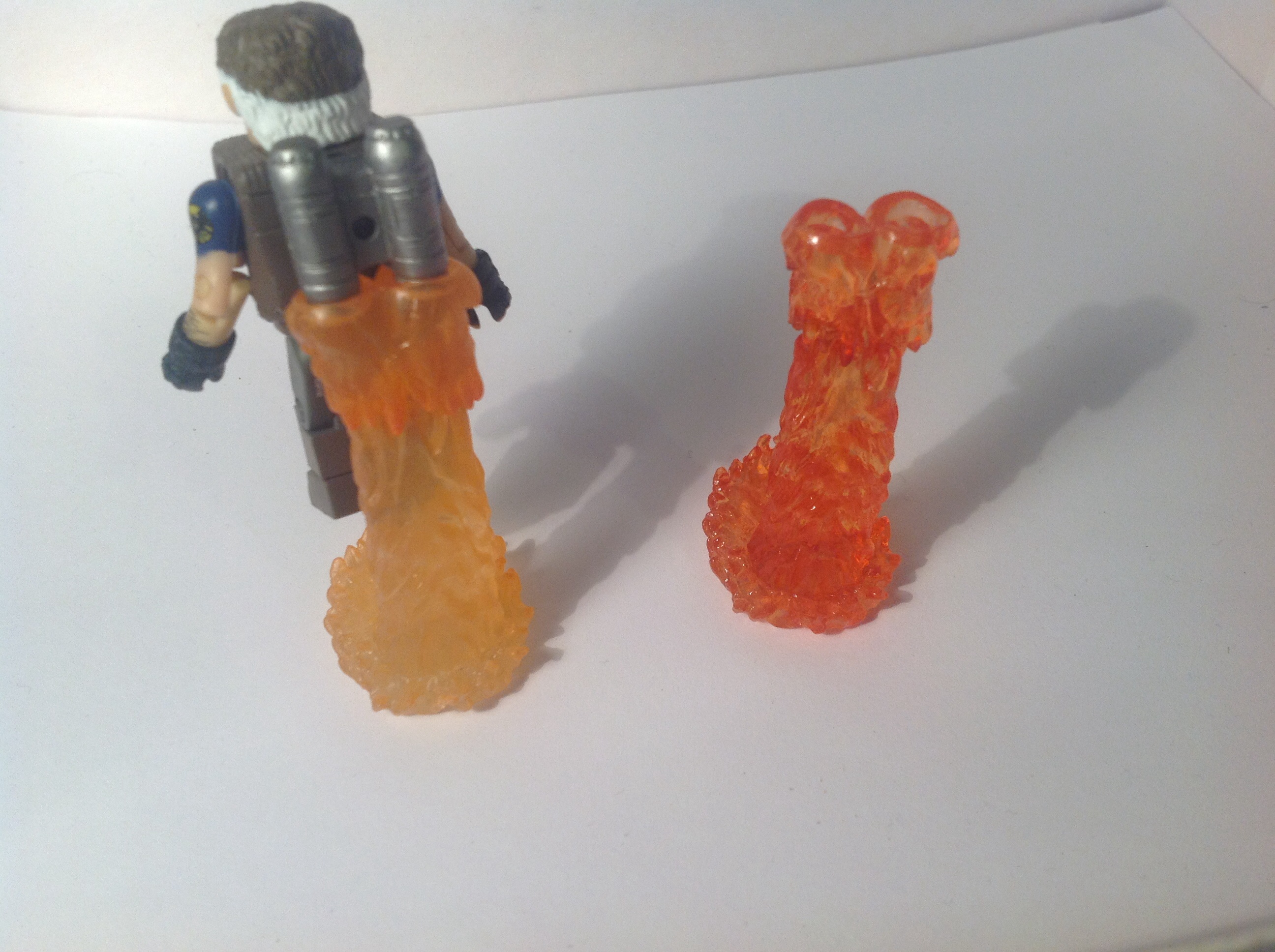
The jetpack flames are unique, as all the other times it’s been used It’s been in a red transparent colour where as with this version its more of a solid orange colour.
AOU Nick Fury is earning himself a 9.5 out of 10. If the jetpack was removable, it’d be an easy 10 out of 10.
Articulation
Both figures have the standard 14 points of articulation. The only part slightly hindered is Nick Fury’s head, as the vest stops him from looking up or down.
Comparisons

Here’s AOU Nick Fury next to Nick Fury Jr.. I honestly don’t know which one is best- they are both absolutely amazing figures.


And heres AOU Iron Man next to a fellow non-bulky armour, the Mighty Iron Man. I defiantly prefer the AOU Iron Man.
The photo gallery will be featured at the end of Part 2!
Thanks for reading! Apologies again for how late it was!
TRU Minimates Wave 17: Superior Spiderman and Electro
Welcome to my first Minimate review!
Before I get started, I want to apologise because I got this two pack a few weeks back, so I don’t have an in-hand look at the packaging. However, I’ve scoured Google images and came across some decent pictures of it.

I really like the star-burst effect and the shade of purple used on the recent Marvel Now! themed waves. It really grabs your attention and is a nice colour contrast to the actual figures. There is of course the really nice artist rendering of the two characters on the left and right respectively.

This picture doesn’t have the correct bios, but it’s the only royalty free, good picture I could find. However, all eight characters from this wave are showed nicely and there’s the continuation of the nice purple explosion effect. I think this is one of the cooler waves, with some really good characters like Rescue, Robot Hulk and Black Widow. I do have the bios for the two characters I’m reviewing, but I’ll put them in later.
Superior Spider-Man

Now, I’m not the biggest fan of Spidey. However, the Superior Spider-Man story really pulled me in. It was a very unique story and one that I enjoyed very much, especially the Doc Ock aspect. I was also really fond of the costume. Among Big Time and Scarlet Spider suits I’d say it might even be my favourite, so I was really glad to find out we were getting both incarnations of it in Minimate form. (I’ll be doing a comparison later on.)


Lets first start off with the head. The first thing I noticed was how inconsistent it was. On the front side of his face, the eyes are slightly misprinted, being to far left. On the back of his mask there is also one to many web lines printed on him. However, in person it doesn’t look as bad as it does on camera, and given the scale of these guys it’s pretty hard to notice. I really like the way the eyes came out. They look goggle-ish, and defiantly something Doc Ock would wear. Overall, I’m impressed with the design but it’s let down a little with the bad paint work.


Thankfully the body has much better paint apps. All the web lines came out great and the muscle detail looks fantastic. Simple, but fantastic. The back of him is actually the same as the front, minus the muscles. However, it works perfectly. The top of the shoulders also have a good paint job and they do a believable job of looking like it’s connected to the main body if the suit. The legs are fairly simple and only have muscle detailing on them, but that’s how the design is.


A really nice attention to detail are the hands and feet. There’s a little bit of red paint applied to the tips of his hands and feet. This is very accurate and certainly something I appreciate.

For accessories, Superior Spidey comes with the normal Spider-Man things. The coiled up webline, which I’m not a huge fan of. I wish we’d get an alternative hand that has a bit of web attached to it, like the one we got in the Friends and Foes boxset. He also comes with the much loved clear display stands, but they’re to be expected. And finally he comes with a nice Peter Parker head piece.

It it has a nice determined look. It looks pretty accurate to the comics. I really like the hair piece as well, it’s a reuse if Chris Redfield’s and although not 100% accurate it still fits the character.

Overall Superior Spider-Man has earned himself a pretty strong 8.5 out of 10. If the mask was painted a little better, it might’ve been a 9.
Ultimate Electro

I prefer the design of Ultimate Electro much better than the star-fish-head classic one and it made a lot of sense to include that design in the new movie. Speaking of the movie, this Minimate was released just in time, although we are getting two (three, if you count Max Dillon) movie version in a few weeks.


The head came out fantastically. It’s made out of a translucent blue plastic and has white and dark blue paint apps on top of it which capture Electro’s face magnificently.


The body, much like the head, is relatively simple. There are various blue and white details all over him to pronounce his muscles, whats really cool is that there’s no curved or straight lines- they’re all zig-zags, made to look like lightning.
These details are also carried onto the legs, but unfortunately there’s nothing on his hip piece.

He comes with a total of six accessories. He has the usual display stand as well a a translucent blue base that imitates electricity. Unfortunately, it’s very difficult to get him on it. I find it easiest to remove the foot, place it on the base then attach the rest of Electro. I think the base was first used on a Human Torch figure, but it’s a perfect piece for Electro as well. He also has two charged up pieces of electricity that clip onto his arm, as well as two of Whiplash’s whips but in blue. All of these parts transform him into a nice charged up Electro.
For a final score, Electro is going to get himself a 9 out of 10. He’s near perfect!
Bios
Superior Spider-Man’s bio says: “Spiderman is not the man he once was. His ego is bigger. His technology is stronger. He’s better than he was before… Or is he? When his mind is not his own, Peter Parker needs to find a way to regain control.”
I think that’s a really neat bio, and sums up the storyline without giving away any spoilers.
Ultimate Electro’s bio reads: “Given electrical powers in an attempt to replicate Captain America ‘s Super-Soldier Serum, Max Dillon becomes an enforcer for Kingpin, where he frequently faced off Spiderman and the Ultimates.”
Again; a brilliant bio. I never understood how trying to make someone stronger gave them electrical abilities…. Then again, I never really read the Ultimates storyline.
Articulation

Both figures have the standard 14 points of articulation. Ball jointed heads, ball jointed shoulders, 90 degrees bend at the elbow, swivel at the wrists, swivel at the waist, ball jointed legs, 90 degrees bend in the knee and a swivel in the ankle. None of it is hindered since they have no extra parts on top of them so you’re able to get them into some great poses.
Comparisons


As I said earlier, I would compare the two Superior Spider-Man costumes. The TRU version is defiantly the superior, but I think it’s down to personal preference and which costume you prefer.


I wasn’t sure who to compare Electro with at first, but in the end I decided to compare him another translucent blue buddy- Cortana. As you can see, Cortana is more of a purpley-blue, where as Electro is a flat out blue. I think I prefer the shade of blue used on Electro, but the one on Cortana defiantly fits the character.
Photo Gallery
I had a lot of fun posing these two around. Enjoy!


Thanks for reading, up next I think I’ll be reviewing one of the new-ish four packs so stay tuned for that!
Catch you next time!
Wave 55 Breakdown!

Wave 55 comes out next week and I can’t wait! I live in the UK, however, so I’ll probably have to wait a week or so longer…. But in the meantime I’ve done this post to show off some of the pictures for the super-exciting looking Captain America themed wave. I found all these pictures on Diamond Select Toys’ Facebook page, linked here: DST Facebook Page
Diamond Select post a lot of cool stuff on their Facebook page, including sneak previews of all their new Minimates, Select Figures and all the other cool oddities that they make.
Now, onto the pictures and the breakdown of Wave 55!
Up first is the two pack containing Classic Cap and the Winter Soldier:
Heres an in hand look at the packaging-

The design reminds me of the Avengers packaging, with the white and blue colour scheme. There’s a nice picture of Cap in his stealth uniform in the top left which came out nice. As with all the Phase II Marvel Movie Minimates, there is also the ‘Avengers Initiative’ logo, which gets me hyped for Age of Ultron!
Heres a digital rendering of the two characters-

First of all, let’s start with Cap. I think he looks pretty good, we’ve already gotten him in this costume (or at least a very similar one) in the First Avenger wave. However, let that take nothing from the figure as he looks great overall. I think the belt looks a little clunky, but I’m going to talk about that a little later on.
The Winter Soldier looks great! The details look clean, very movie accurate, and it seems as though he has a small armoury as well. One nit pick, though, is the head. I don’t really like the fact he’s smiling and his hair looks too big for his head. (Never thought I’d hear anyone say that…)

However, all those problems are corrected in this picture. The face has a more stern, serious look and the hair sits fine on his head. As mentioned before, he comes packed with accessories and I love that they’re all able to be holstered, except the sniper. I especially like the knife sheaths, very screen accurate. The mask also looks fantastic and really sets the eerie look of Bucky.

Like I mentioned before, I thought the belt looked to big on Cap. But in this picture it looks fine. I also am a big fan of the new helmet sculpt (I think it’s new.) I wish he had some place to store the shield, but it might’ve ruined the costume. I think the face is pretty good, as well.

Here we have the Stealth Uniform Captain America and Brock Rumlo set. I loved the way the stealth suit looked on screen, and I thought the blue shield was a nice change-up from the classic red one. The figure captures all these details perfectly, and I applaud Art Asylum/ DST for the great Chris Evans likeness, considering this is a 2-inch, cylinder shaped head. I thought Brock was a great addition to CATWS, and I found it pretty interesting how at the end instead of him dying from his wounds, he was wheeled of on a gurney covered in burns. Maybe that’s a clue for a future villain? I sure hope so! I think the SHIELD gear looks good, and judging by the holsters he should be included with an assortment of goodies.

This picture gets me even more hyped for the figure. Again, I praise the producers for fantastic paint applications; just look at those gloves! The shield also appears to be a nice metallic colour, and it’s a really cool to see the inclusion of a back peg to store the shield. I think I prefer the face on this one a bit more, but that might’ve been down to the expression.

As I said, Rumlow comes with some nice accessories. I especially really like the baton. The chest tampo is a really cool hint at Crossbones, of course, and the straps were also present in the movie. An interesting point is that his name is listed at ‘Crossbones’, even though I don’t recall him being called such in the movie. Although not perfect, the face looks much better in this picture. The hair colour differs between pictures, so I’m not sure which one is the final colour but I think I prefer the dark brown.

This two pack features Batroc and Agent Sitwell, two very minor characters but by no means bad ones. I really enjoyed the opening scene with Batroc in, it was awesome. Like with Rumlow, I found it really interesting that we saw Batroc a little later on in the movie alive and well, so again, maybe he’ll have an upcoming role. Sitwell is an integral character in the Marvel Movieverse, he’s appeared briefly in Thor, Avengers, Agents of SHIELD and the Avengers mini-series. He had a slightly bigger role in the Winter Soldier, being a double crossing member of Hydra. I would say he is going to appear in a future movie, but I’m not sure. Does he die? It looked as though when the Winter Soldier threw him out the car he got hit by a truck, but I’ve watched the movie three times now and I still can’t tell…
Anyway, Batroc looks excellent. I didn’t notice how much purple was on him, but it’s defiantly a nice nod to his comic counterpart. Sitwell looks kind of… Generic… But I have a soft spot for Mimimates in a suit, and he comes with some really sweet accessories…

…like a SHIELD coffee mug! I think the coffee mug was featured in “Item 47”, but I can’t quite remember. Either way it looks like a great piece. The briefcase might be a reuse from the Thieves of Thieves boxset. He also comes with a pistol. I think the face likeness is almost spot on but something seems a little off.
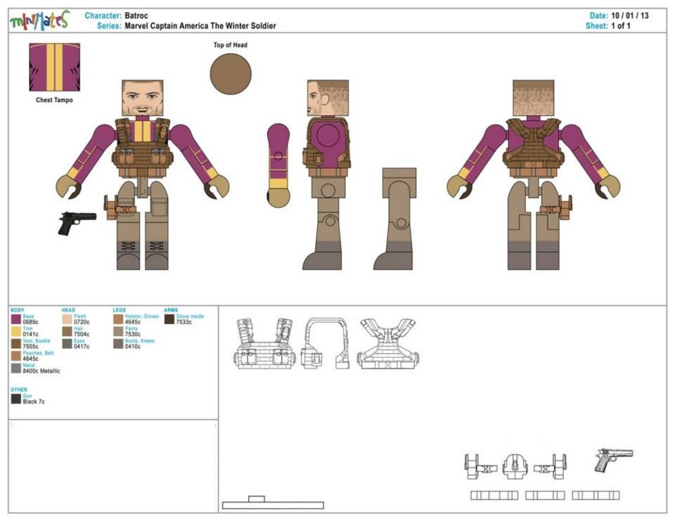
The face on Batroc looks excellent. The likeness to George St. Pierre is fairly good and defiantly has a mean look on his face. Like I mentioned, he has a good shade of purple on him that fills up more of the character than I thought. My only small gripe is that I wished he came with some more fire power.

I purposely saved the best to last, the real stars of CATWS, Falcon and Black Widow! Both of these figures look to be the potential best in the wave. I loved the previous Avengers Black Widow and the Iron Man 2 version wasn’t to bad either. This version looks to be the best. The suit is a more practical looking, and although it looks grey in this photo the final one is black. The main difference is the hair, and I think it looks better like it is. Falcon looks flawless, the wings, goggles and even the trousers look fantastic.

I really like the way this figure came out. Again, the hair looks good and I like the new suit. The pistols look nice, even if they are the standard Blackhawk ones. I always appreciate the fingerless gloves on Mimimates. The face has a fairly decent likeness, but the thing I like most is the expression. The IM2 one had a confident smile, the Avengers one looked like she was pouting but this version has a gritty, determined look. And it looks great!

Heres Black Widow in a really nice action pose, and you can see the suit is in fact a nice black colour.

Im blown away by the amount of detail put into this. Look at all the sculpting on the wings, it’s especially impressive considering the size of these guys. I think the camo trousers came out fantastically and they consist of nice shades of blue. The goggles are a nice translucent red, and they just slip on top of the head, which is nice because it makes them removable. For accessories he comes with a flight stand as well as two guns.

For the final picture, we have a tray shot of all eight figures, in all their glory. You can see Falcon’s guns are a reuse of Nick Fury Jr.’s and the really nice chrome colour on Stealth Suit Cap’s might shield. Something a bit worrying is there doesn’t appear to be a coffee mug included with Sitwell, which is really disappointing.
So there is my breakdown of the Marvel Minimates Wave 55: Captain America the Winter Soldier. I’m really excited for this wave and I’ll defiantly be reviewing them on this site. In the upcoming week or two however, I’ll be reviewing some of the new, and possibly older Minimates, so stay around for them!
Just before I go, here’s a link to my Facebook Page.
