Welcome back to another (very, very overdue… Sorry) Minimate review!
This is probably one of the best boxsets released in a long time. As the title states, I’ll be splitting the review in half so that I can talk in as much depth as possible about each figure. Also, like the last review I unfortunately no longer have the packaging but thanks to Google I can show it to you.

I really, really like the box. I don’t think any other boxset or series has ever had the golden colour, but as I said- I absolutely love it. The picture of Ultron up top looks awesome and the cartoon pictures along the side always look fantastic.
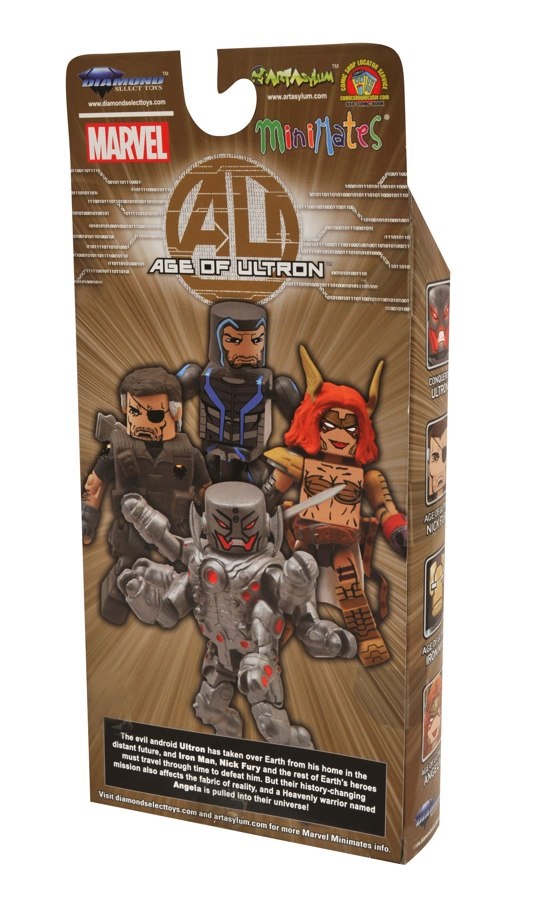
The back of the box is equally impressive. The computer- rendered image shows of all the figures quite well. Although, Iron Man has no hole in the top of his head but the actual figure does.
The bio reads “The evil android Ultron has taken over Earth from his home in the distant future, and Iron Man, Nick Fury and the rest of Earth’s heroes must travel through time to defeat him. But their history-changing mission also affects the fabric of reality, and a heavenly warrior named Angela is pulled into their universe!”
Nice read-up. I prefer bios for individual characters, however.
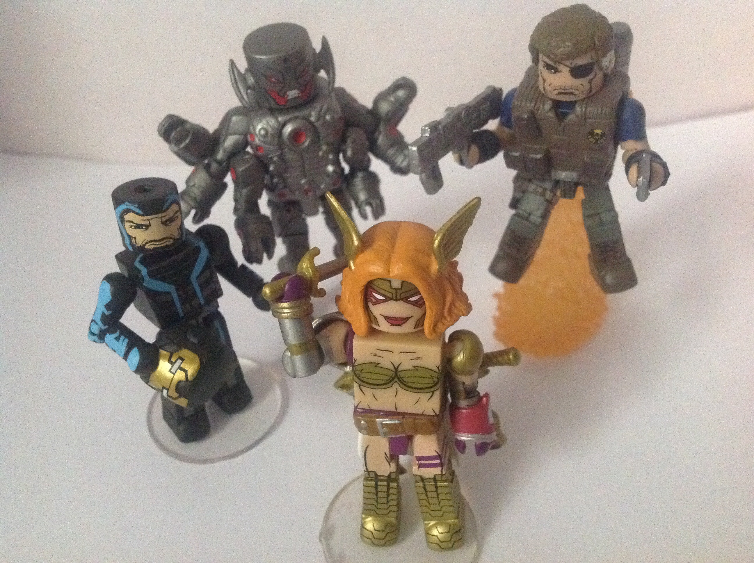
Age of Ultron Iron Man
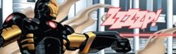
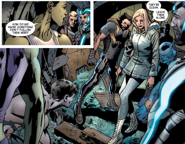
Finding a comic picture for this suit was very difficult. First of all, I think he wore the suit pictured above in the AOU storyline (though I could, probably, am wrong.) and the only other pictures of the suit, dubbed the “Zero Gravity” suit were of a Marvel Universe figure.
*Thanks to DSTZach for providing a picture of the suit from AOU-
Pushing that aside though, here’s the actual review of the figure.
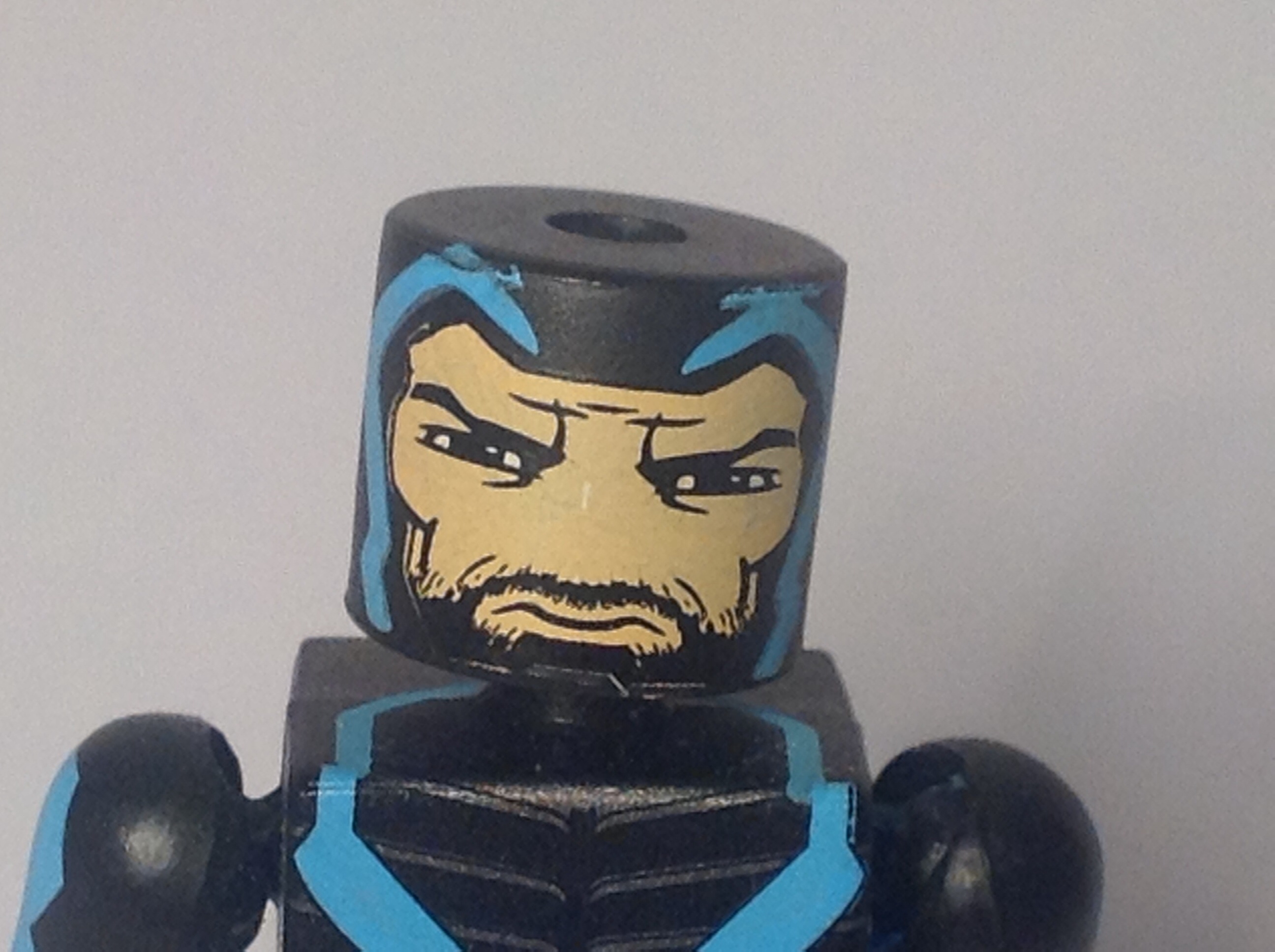

The face is very well done. The blue lines really stand out on the black. The face has a stern, serious look which is something different from the usual smirk of a Tony Stark. It’s also great to see two different shades of black were used on the beard and the helmet. The back of the helmet is unfortunately blank, but it’s something easily overlooked.


This Iron Man is a little different from the others, as it has no bulked up pieces. It’s something unique and I can see why they chose to go this route. All the details are nice and crisp and with the exception of a small scratch on the back are all done perfectly. I love the continuation of the blue line work, it just looks so cool in comparison with the black and greys. The legs continue to have nice paints apps and the bottom section of the leg is a metallic grey colour.
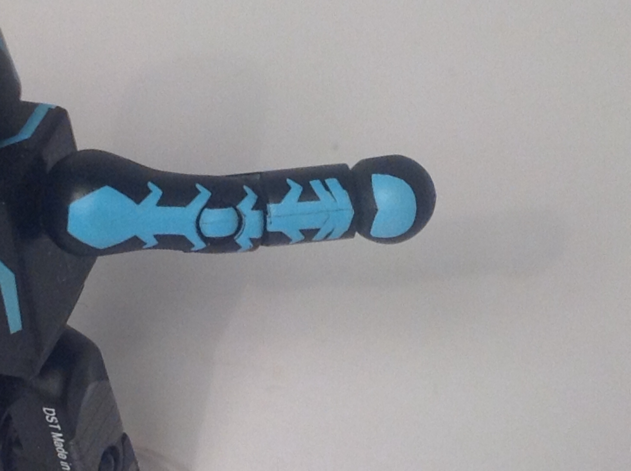

Some if the really nice details include the arms and the top of the torso. Getting paint details on the top of torsos is a rarity and is necessary for this figure. The arms as well as the hands look fantastic, the blue wiring came out superb.
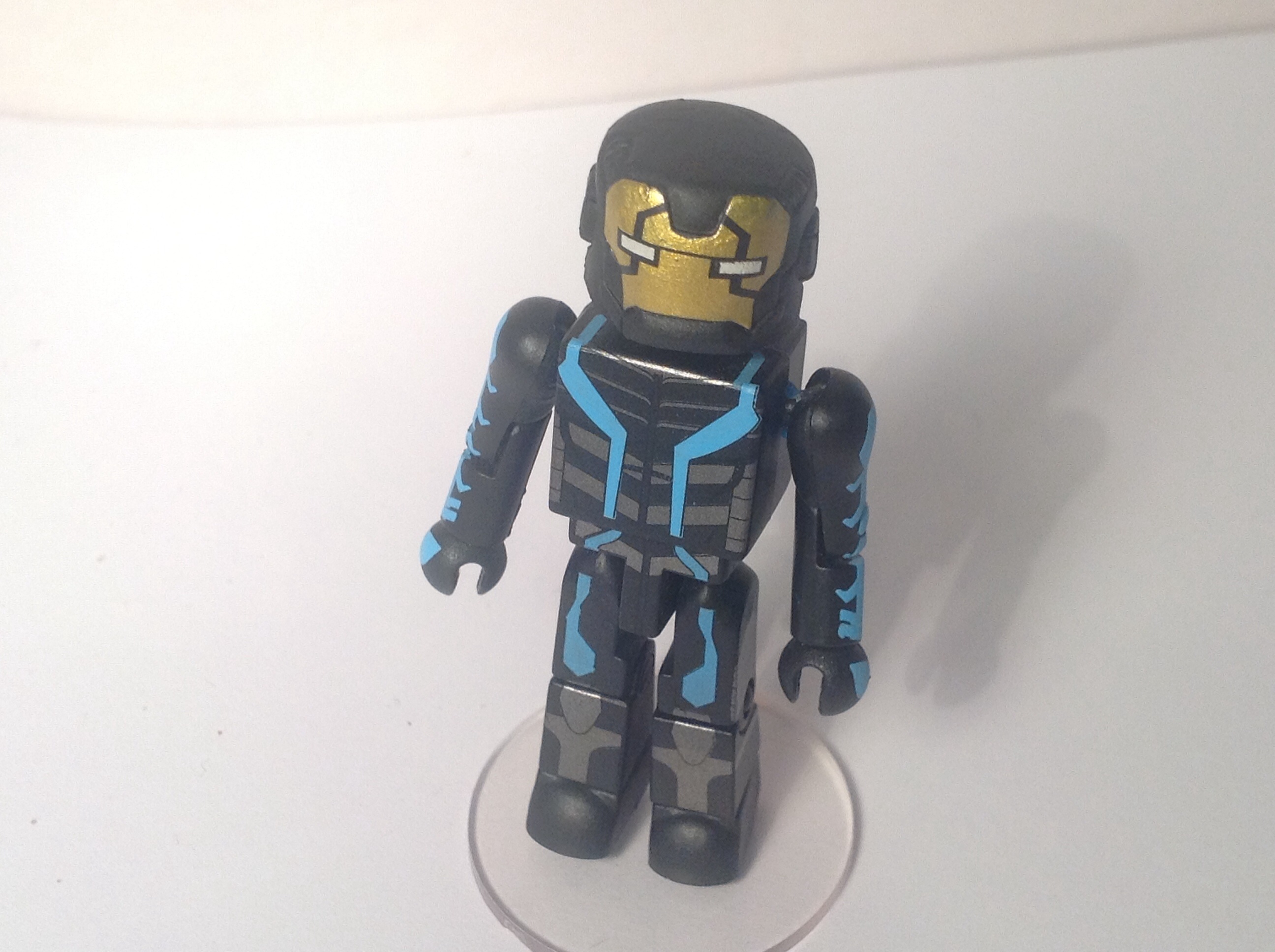
For accessories he comes with the staple display stand as well as a helmet, which I don’t really like. The gold colour just doesn’t match with the rest of the design and I think it should’ve been either a blue or grey. I suppose that’s the design of the character its not DST or Art Asylum’s fault, though.
For an overall score, I’d say AOU Iron Man has earned himself a pretty strong 8 out of 10.
Age of Ultron Nick Fury

After the huge success of Samuel L. Jackson’s take on Nick Fury, all of the new comics seem to based of that appearance. Unlucky David Hasselhoff. However, in the AOU storyline they went back to a more scruffy looking Nick Fury. I prefer the ‘Jackson Fury, but an updated white Nick Fury was sorely needed.
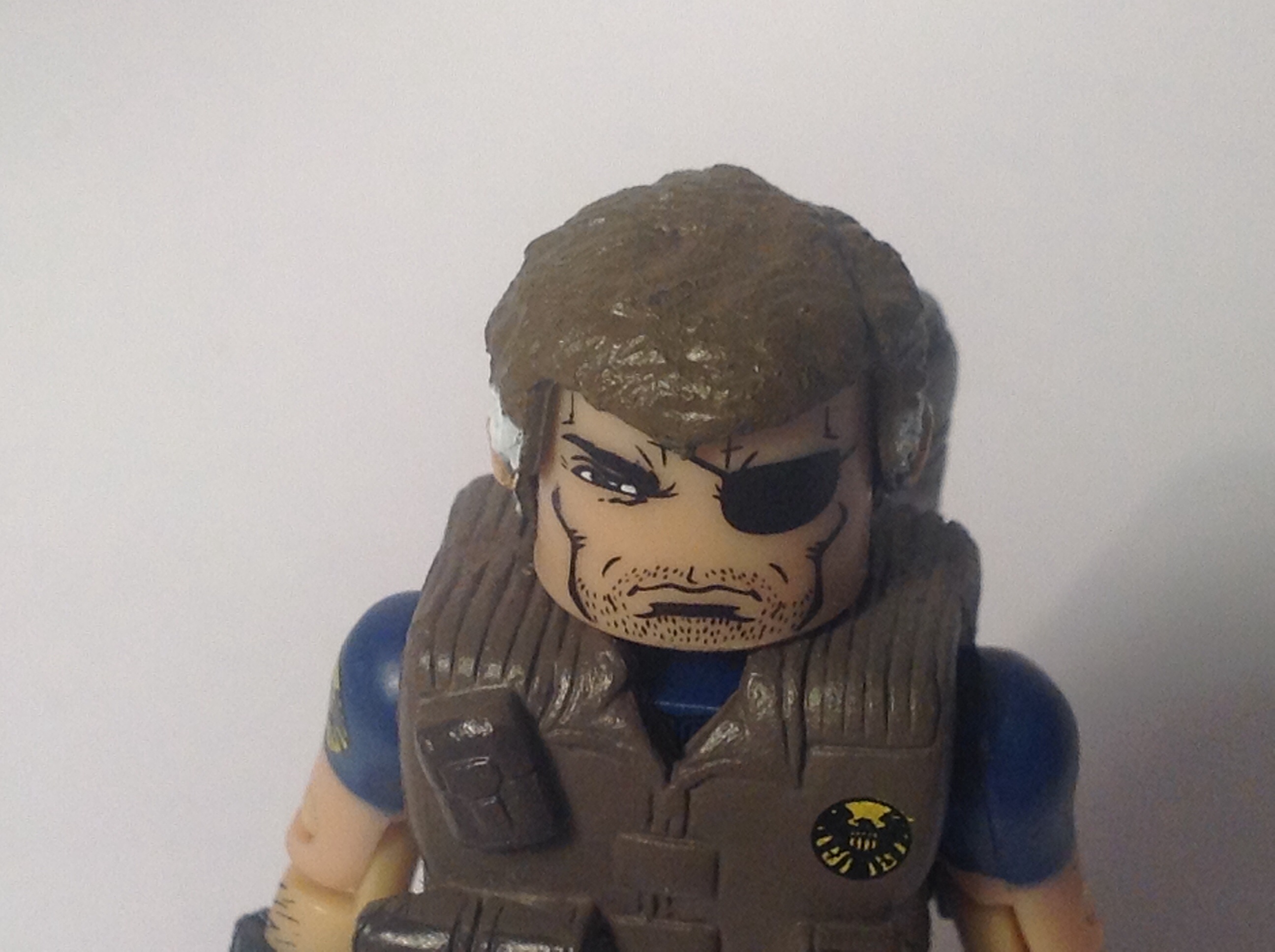

The face is one of the best bits of this figure. The rough looking expression is top notch, and to complete it the un-kept stubble and eyepatch add that much personality to him. The hair is most likely a re-use and it keeps that un tidy look which I love. (But not as much as the trench coat….)
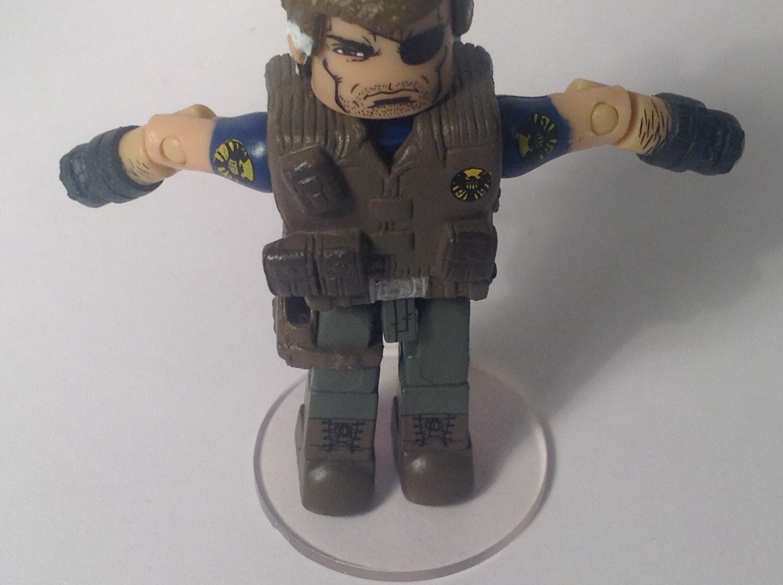
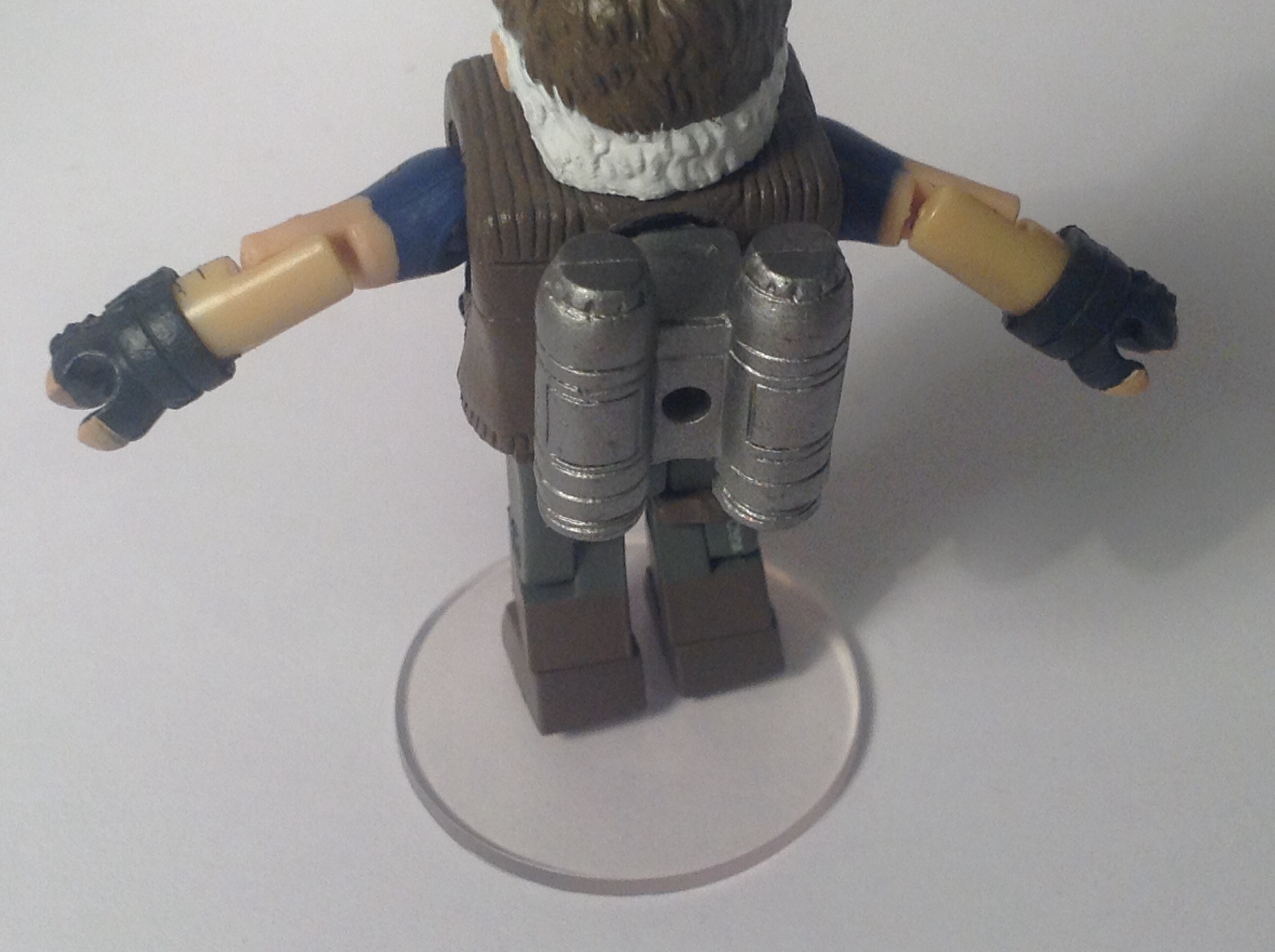

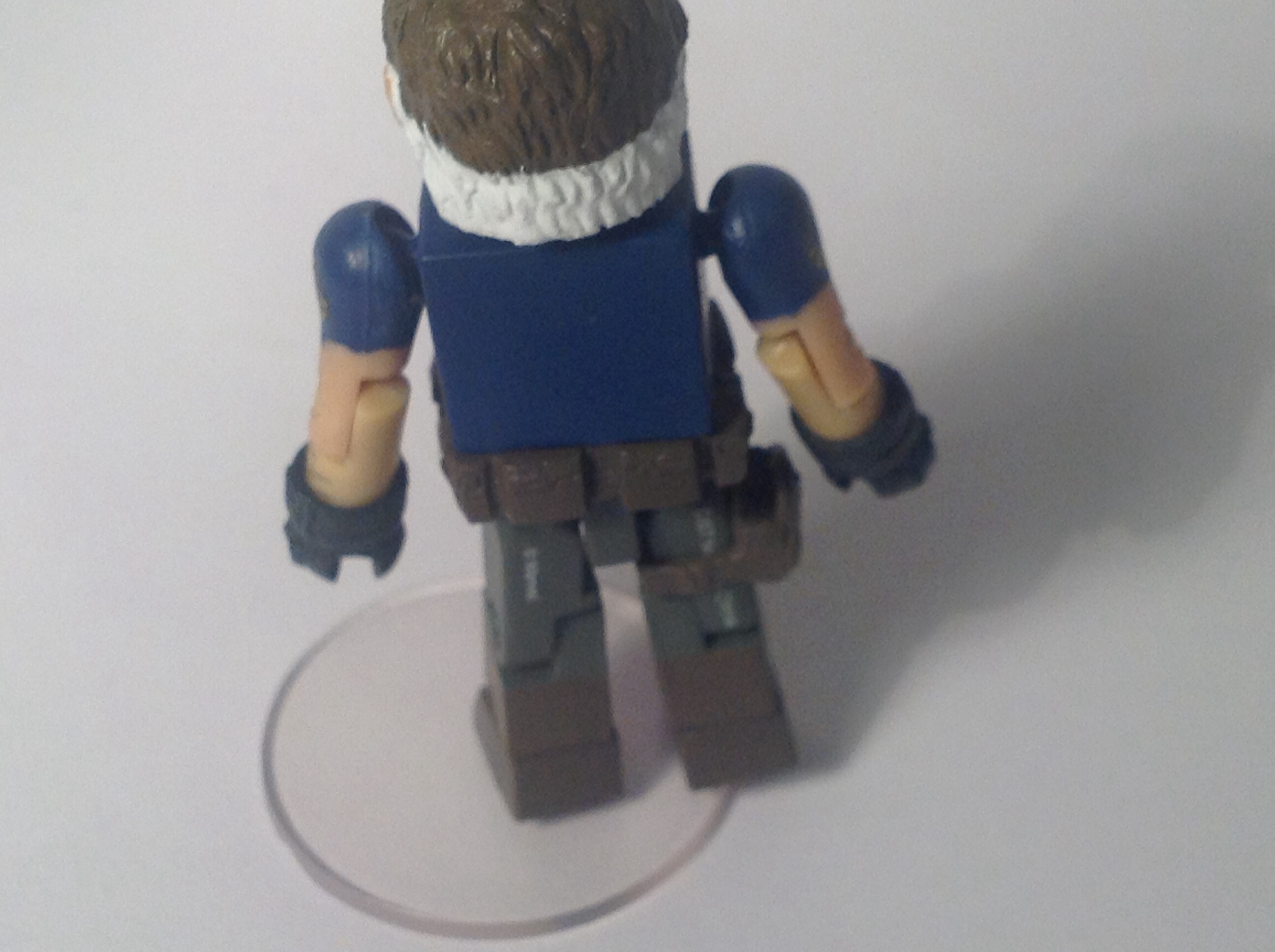
The body has this nice militaristic vest on top of it which is done brilliantly. It has various pouches on it and a nicely painted SHEILD logo on the top right. This is where my one and only complaint with the figure is- the fact the jetpack is not removable. I’m not sure why they chose to do it this way and I haven’t tried to remove it as I’m worried it’ll break the vest piece. The arms are done well and on each shoulder is another SHEILD logo. Another slight nit-pick is that the upper and lower arm are slightly different shades of colour, but it’s barely noticeable as not only does he have a big pair of finger-less gloves on but he also has some nice arm hair painted on. The legs are quite simple and the only real detail are the boots but he also has a holster for his pistol.

A really nice thing about Nick Fury is that under the vest are some really cool details. He is wearing a navy blue shirt which, like everything else, has a SHEILD logo on. I’m torn between which look I prefer but if I had to choose I’d say the vest is a better look for him.
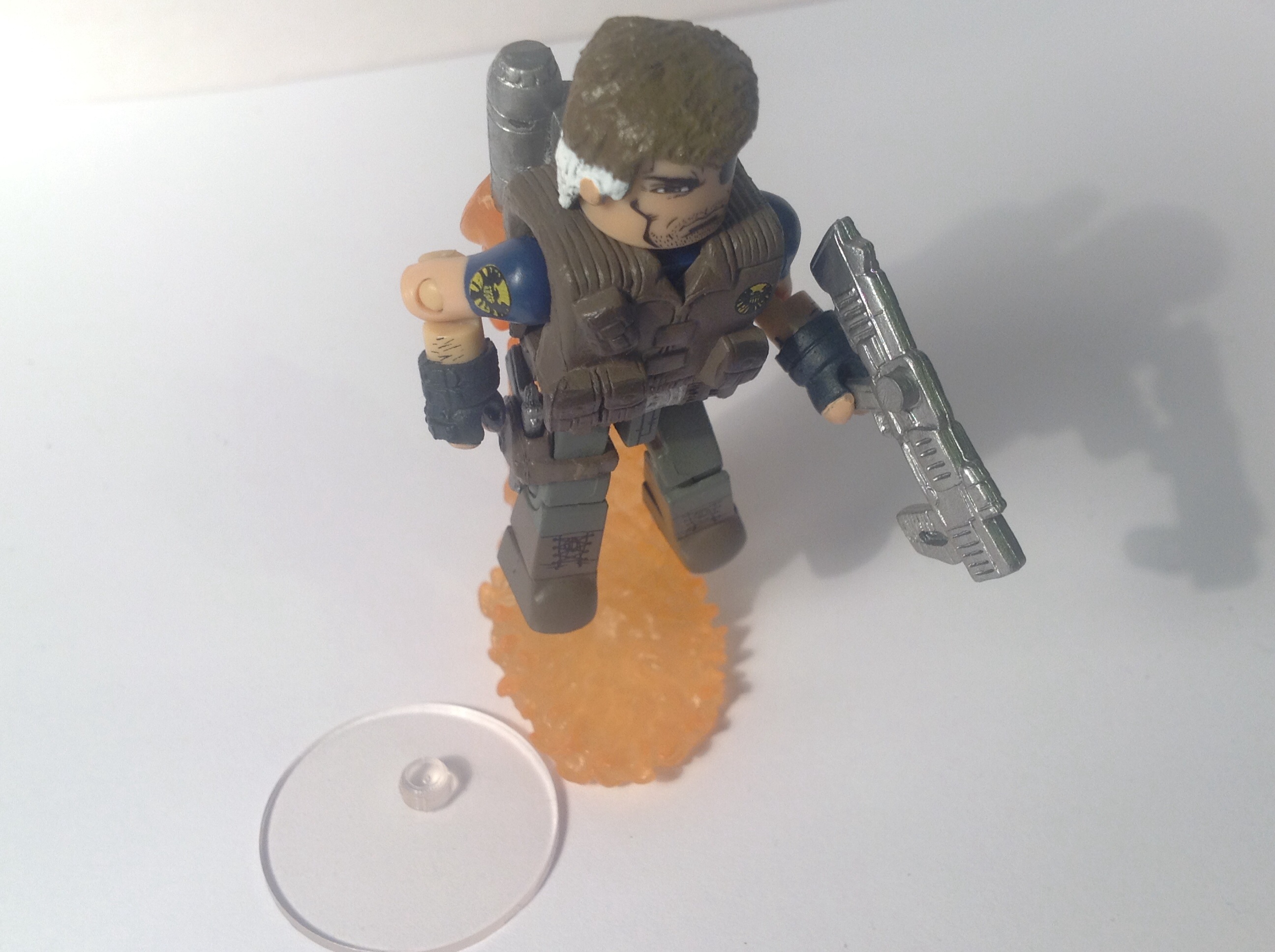
For accessories he also comes with a display stand, but also included is a pistol, Hope Summer’s rifle and the two pieces needed to make the jetpack flying effect.
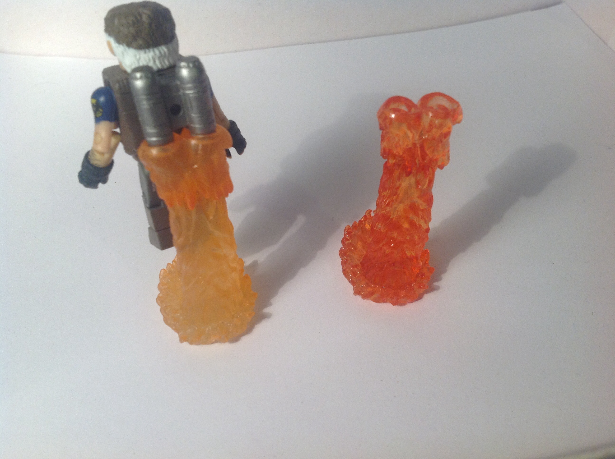
The jetpack flames are unique, as all the other times it’s been used It’s been in a red transparent colour where as with this version its more of a solid orange colour.
AOU Nick Fury is earning himself a 9.5 out of 10. If the jetpack was removable, it’d be an easy 10 out of 10.
Articulation
Both figures have the standard 14 points of articulation. The only part slightly hindered is Nick Fury’s head, as the vest stops him from looking up or down.
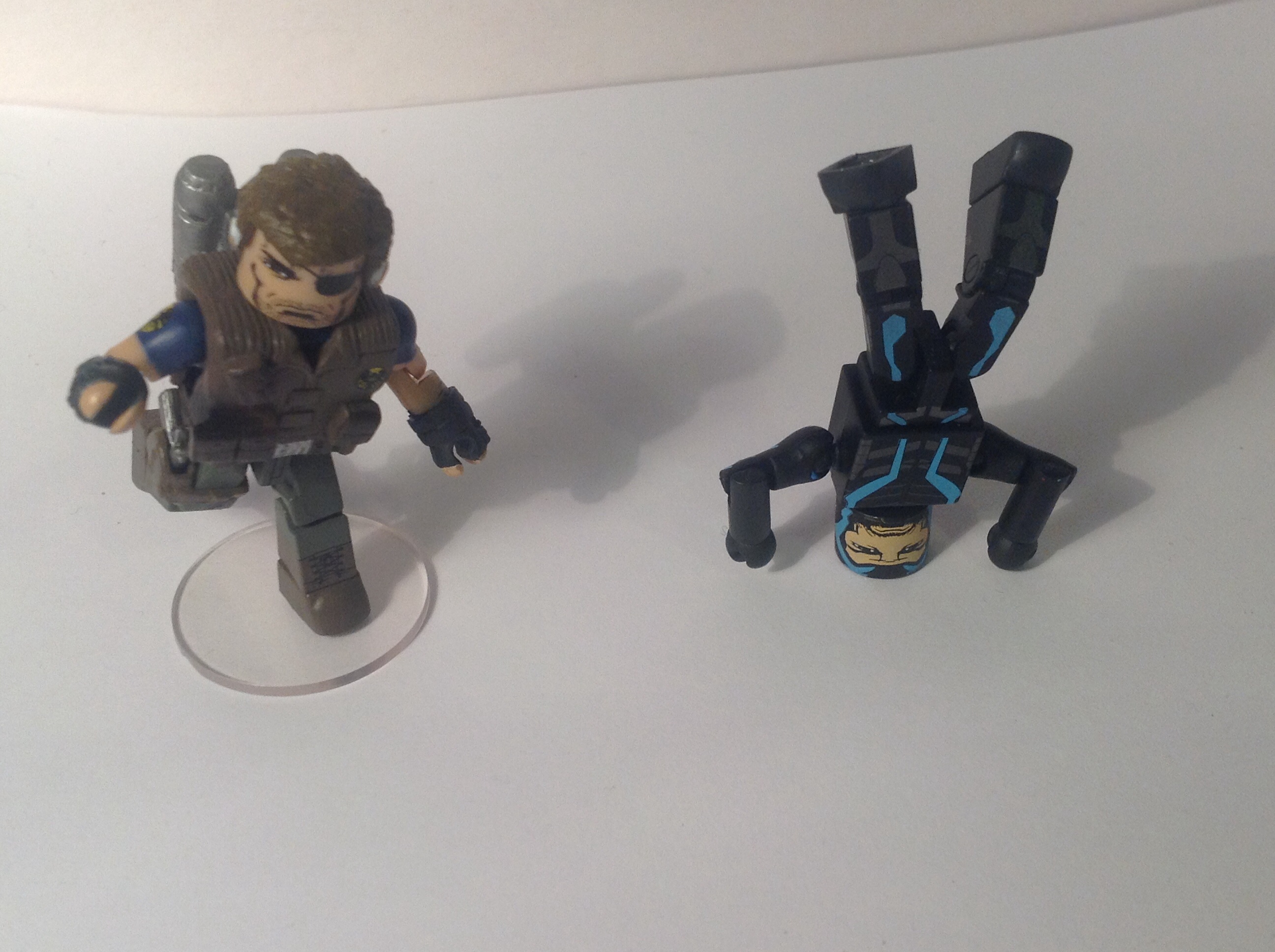
Comparisons

Here’s AOU Nick Fury next to Nick Fury Jr.. I honestly don’t know which one is best- they are both absolutely amazing figures.


And heres AOU Iron Man next to a fellow non-bulky armour, the Mighty Iron Man. I defiantly prefer the AOU Iron Man.
The photo gallery will be featured at the end of Part 2!
Thanks for reading! Apologies again for how late it was!

It’s Iron Man’s present-day uniform in AoU. You can see a bit of it here:

Thanks for the info. I’ll have to update the post!